Brand Manual
This guide defines who we are and how we present ourselves to the world. A living reference for building coherent and memorable experiences.
Brand Identity
Brand Essence
Different
Different
A unique approach that stands apart from the ordinary. We don't follow trends—we question them.
Rooted
Rooted
Grounded in classical wisdom and timeless principles. We build on solid foundations.
Growing
Growing
Committed to sustainable, lasting progress. Organic growth takes time.
Personality Traits
Wise
We draw from classical philosophy and proven principles. Knowledge is applied with care, never shown off.
Clear
We communicate with precision and simplicity. Complexity is distilled into understanding, never obscured.
Warm
Approachable and human. Technical excellence delivered with genuine care and personal attention.
Crafted
We take pride in quality work. Every detail matters. We build to last.
Patient
We think long-term. Growth is organic, sustainable, and intentional.
Enduring
We create digital legacies. Our work is built on foundations that withstand time.
Voice Spectrum
Tone
Mood
Language
Presence
Professional but not cold, knowledgeable but not arrogant, warm but not overly casual.
The Sage
We are seekers and transmitters of knowledge. Our purpose is to help others understand the world and make better decisions through knowledge, experience, and thoughtful guidance.
Core Values
Integrity
Honest, transparent, and ethical in every interaction.
Excellence
Quality over quantity, always.
Patience
Long-term thinking, sustainable growth.
Care
Genuine investment in every client's success.
Message Pillars
Built to last
We create digital foundations that endure—not quick fixes, but solid structures anchored in proven principles.
Wisdom applied
Classical philosophy meets modern technology. We bring timeless thinking to contemporary challenges.
Partners on the path
We are invested in your journey. Your success is our success—we grow together, sustainably.
Do
- Speak with quiet confidence
- Use clear, concise language
- Reference timeless principles
- Show genuine expertise without pretension
- Be helpful and solution-oriented
- Acknowledge complexity honestly
- Use nature and architecture metaphors
- Emphasize long-term value
Avoid
- Use hype or marketing buzzwords
- Make exaggerated promises
- Sound desperate or pushy
- Use excessive exclamation marks
- Be condescending or overly technical
- Follow fleeting trends in language
- Use corporate jargon or clichés
- Prioritize wit over clarity
Tone in Context
Welcome
"We're glad you're here. Let's get started."
Success
"Well done. Another step forward on the path."
Error
"Something went wrong. Let's fix this together."
Wait
"Good things take time. We're on it."
Guidance
"Small actions make a difference."
CTA
"Ready to start? Let's talk about your project."
Logo
Primary Logo
HorizontalThe horizontal version is the preferred form of the logo. Use it whenever space allows.
Stone / Light
White / Dark
White / Teal
Stone / Amber
Secondary Logo
VerticalThe vertical version is ideal for square spaces or where greater vertical presence is needed.
Stone / Light
White / Dark
White / Teal
Stone / Amber
Monogram
DGThe monogram is used in reduced spaces such as favicons, avatars, and applications where the full logo is not legible.
Light
Dark
Teal
Amber
Teal
Amber
Clear Space
Unit of measure (X) = height of the capital "G". Minimum space of 1X on all sides.
Minimum Sizes
| Variant | Digital | |
|---|---|---|
| Full Logo | 120px | 32mm |
| Vertical | 80px | 21mm |
| Monogram | 24px | 6mm |
Incorrect Uses
Do not distort
Do not rotate
Low contrast
Do not use brand colors
Color System
Our palette balances minimalism with warmth. Stone provides the elegant base in black and white. Teal and Amber add life and energy—used sparingly as accents to maintain visual clarity.
Stone
Base
#0c0a09
Teal
Primary
#0d9488
Amber
Secondary
#f59e0b
Stone
BaseBackgrounds, text, and borders. The neutral, elegant base.
stone-50
stone-100
stone-200
stone-300
stone-400
stone-500
stone-600
stone-700
stone-800
stone-900
stone-950
Teal
PrimaryPrimary actions, success states, and links.
teal-50
teal-100
teal-200
teal-300
teal-400
teal-500
teal-600
teal-700
teal-800
teal-900
teal-950
Amber
SecondarySecondary actions, alerts, and accents.
amber-50
amber-100
amber-200
amber-300
amber-400
amber-500
amber-600
amber-700
amber-800
amber-900
amber-950
Theme Tokens
Light Theme
Dark Theme
Typography
Urbanist
Primary--font-sans · Sans-serif
Let's build something different
Interface, headings, body text. Geometric with humanist warmth.
Pesos disponibles
Aa
Extralight
200
Aa
Light
300
Aa
Regular
400
Aa
Medium
500
Aa
SemiBold
600
Aa
Bold
700
Conjunto de caracteres
ABCDEFGHIJKLMNOPQRSTUVWXYZ
abcdefghijklmnopqrstuvwxyz
0123456789 !@#$%^&*()
Fraunces
Secondary--font-serif · Serif
Ancient wisdom, modern tools
Editorial content, display text. Classical warmth with expressive axes.
Pesos disponibles
Aa
Thin
100
Aa
Light
300
Aa
Regular
400
Aa
Semibold
600
Aa
Bold
700
Conjunto de caracteres
ABCDEFGHIJKLMNOPQRSTUVWXYZ
abcdefghijklmnopqrstuvwxyz
0123456789 !@#$%^&*()
Geist Mono
Technical--font-mono · Monospace
const growth = 'different';
Code blocks, technical data, timestamps. Optimized for code.
Pesos disponibles
Aa
Regular
400
Aa
Medium
500
Aa
SemiBold
600
Aa
Bold
700
Conjunto de caracteres
ABCDEFGHIJKLMNOPQRSTUVWXYZ
abcdefghijklmnopqrstuvwxyz
0123456789 !@#$%^&*()
Type Scale
Shape System
Our shape language uses straight, square corners to convey precision, structure, and architectural clarity. The absence of rounding reinforces an editorial and decisive aesthetic—every element is deliberate and clean.
Base Radius
0rem
0px · Square corners
xs
0rem
sm
0rem
md
0rem
lg
0rem
xl
0rem
2xl
0rem
3xl
0rem
4xl
0rem
full
0rem
Usage examples
0px
0px
0px
0px
Iconography
Hugeicons
hugeicons.com · Style: Stroke Rounded
46,000+ icons in 59 categories
Sample Icons
Stroke Rounded
Use this style exclusively
Clean Geometry
Simple, recognizable shapes
Softened Edges
Accessible, modern aesthetic
Photography
Visual Direction
Photography draws inspiration from classical aesthetics: Mediterranean landscapes, ancient architecture, natural growth. Images should feel timeless, warm, and contemplative.
Color Tone
- Golden hour lighting
- Warm shadows
- Muted earth tones
Style Examples
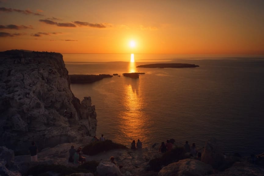
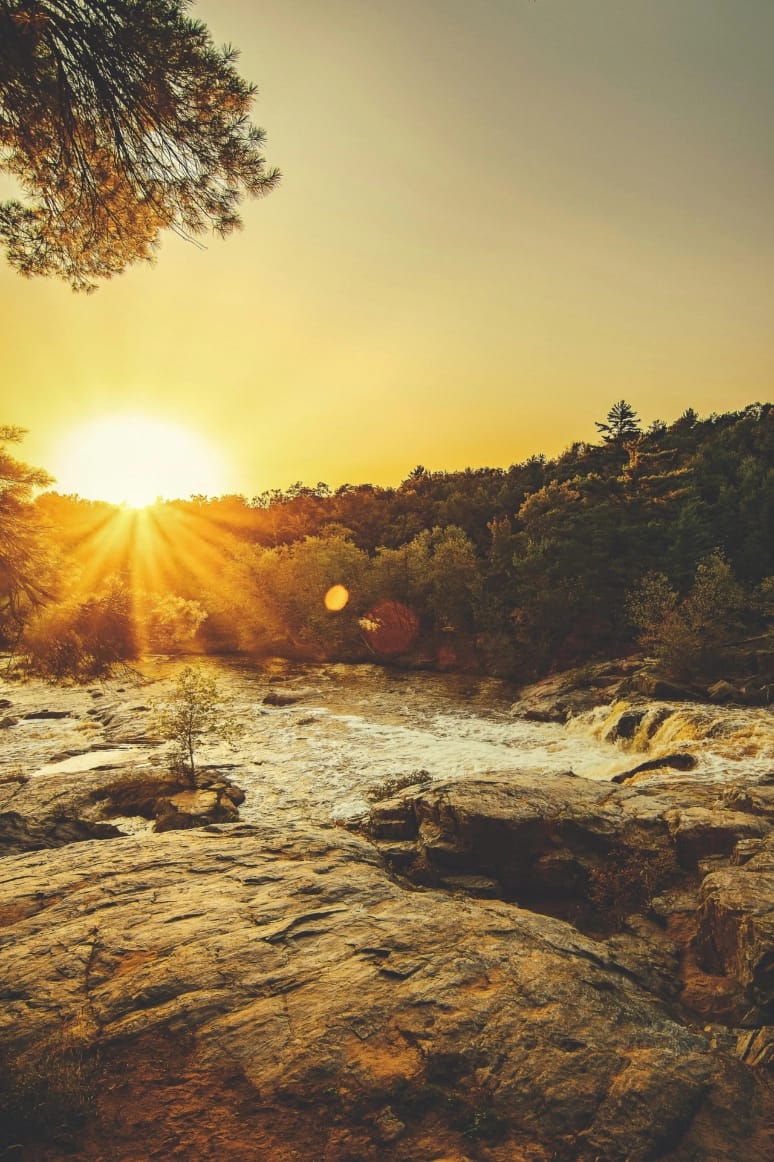

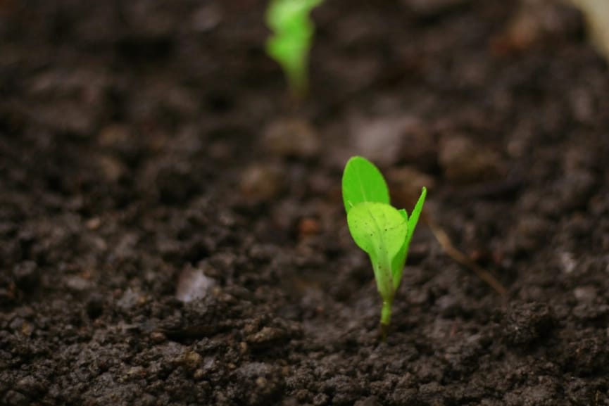

Mediterranean landscapes, classical architecture, natural growth
Important Rule: Teal in Photography
Teal is reserved exclusively for digital and graphic elements—buttons, links, icons, illustrations, and typographic accents. Never apply teal as a color filter to photography.
Image Treatment
Warm Filter
Add subtle warmth to enhance golden tones
Muted Saturation
Reduce saturation for a timeless feel
Rich Shadows
Deep blacks with lifted shadows
Illustrations
Illustrations balance organic forms with geometric precision— reflecting the blend of ancient wisdom and modern technology.
Minimalist
Reduce to the essentials. Every element must serve a purpose. Embrace negative space as a design element.
Organic
Incorporate natural forms and fluid curves. Reference growth, nature, and classical motifs.
Warm
Infuse life through amber and teal accents. Illustrations should feel welcoming, not cold or sterile.
Cohesive
Use fundamental elements to build cohesive illustrations. Maintain consistent stroke weights (1-2px).
Let's Build Something Different
This manual is a living guide that evolves with us. If you have questions about its application or want to work together, we're here to help.